Getting Used To Pon 101 #community
The hub and heart of the site is no doubt our community, I've tried to keep things engaging but simple. It's my first port of call when I visit, obviously due to me already knowing the content on the home page.
It's the place also most commonly people visit, so I try to make sure it's not over cluttered.
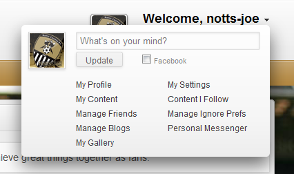
1) If you click where it says "Welcome *your username*" you will see a menu display. This is where all sorts of useful likes are found and of course the place to edit your settings.
It's pretty straight forward once you notice it, although you can do

A useful tip to both Newpies and of course existing members


Easily noticeable is Community Message and of course the Community Notice, you don't have to take to much notice of these but eventually they will change.
To the right, you will see the "sidebar" here we feature all the little pieces we feel you might be interested in. Next Match Block, Member of the Month, Mini League Table, Recent Status Updates, and Recent Topics.
The Recent Topics is another useful way of keeping up-to-date with on goings within the community.
If you follow this straight down, you will see a large block which lists Newest Users, Top Posters, Top Forums and Recent Posts.
It's always nice to welcome a new member and you will find that one of our friendly members usually start a thread to welcome them, the two others "Top Posters" and "Top Forums" are just interesting information but of course again, the Recent Posts is another quick way to keep tabs on what's going on.
Just a little lower than that, you will find some more useful information. A row of "Statistics" and then the "Who's Online", along with a little key legend to let you know what colour means what.

This pretty much wraps the community index page up, in my next 101 blog series. I will cover #Posting. I hope these will be useful to everyone and if you're a new member please express yourself, seriously we're a very friendly community and it's the interactions which make any site.
Right at the very bottom, we have our "Footer" with useful links inside. In the middle there's a button to send you back up to the top of the site, to the left - Change Theme (useful if you're on a mobile and the sites no detected your device) - Mark Community Read - Help - Rules and Privacy Polcy. To the right our copyright details and beneath you will see our chat system. The far right button (which I think looks like a pill) is the toggle on and off switch. Next to that the "blue and white" people icon, is our chat room and to the side very much like Facebook is the individual chat area (as you can I'm talking to Super Ram).
To the left you find our social pages.

Here's my previous Blog | Getting used to PoN 101 #Basics
Thanks for reading!


Recommended Comments