Jump to content
Featured
Joe Jones
Joe Jones

Joe Jones: Why I am not impressed with new Notts County kits

When it comes to club football, and particularly in the lower leagues with each team's 50+ games per season, fans have a constant, near-dizzying supply of football to keep them busy for most of the year.

And then, for about six weeks, nothing. No more games and very little news in drips and drabs, like the retained list coming out, new players coming in and ones already on the books penning new deals or saying "ciao adios I'm done".

But now we're heading towards the end of June, the crucial things that will provide infrastructure for the following season begin to take shape. First we had the fixture list coming out (difficult start, so best hit the ground running), and now, the new kits are out.

Now I quite liked the 2016/17 kits. The home shirt was classic Notts, with neat stripes just the right size, and I thought the away kit was a nice, strong, bold colour (hot pink, not red!).

But I was really excited about the new kits. After all, Puma is a "proper" brand with a history of gorgeous kits, and with the Newcastle United kit revealed in May, which I found sleek and neat, I was banking on something similar.

Fast forward to 27 June, and there I was looking forward to Wednesday morning, only to find out the kits would be revealed in the evening! I couldn't wait.

And then, the kits came out.

The initial surprise of seeing the kits then gave way to a feeling of "erm, well yeah, they're alright... I guess...", much like receiving a lousy Christmas present and having to pretend it's good because, hey, it's the thought that counts - or in this case, it's the brand new Notts kit, and it's Puma!

But now I've had a bit of time to process it, I've made my mind up - on the whole, factoring in the sum of their parts, they're crap.

Sure, they might eventually grow on me - and I've changed my opinion on many things in the past over time (there was a time I disliked Oasis... I was young and stupid). And if Notts end up winning promotion in one of those kits, then they'll become vintage.

But at this moment in time, I can safely say that, out of all the tops, there is one I like, one I don't like much, and the rest I don't like at all.

Let's start with the home shirt. Now, there isn't much you can do with vertical black and white stripes, that much is true. And there have been some designs over the years that have been nothing short of atrocious.

In 2011/12 the designers began marking out the black stripes but then there must have been a fire drill or something and forgot to colour them in, and in 2013-14 they must have watched that Big Bang Theory episode where Sheldon goes to a fancy dress party dressed as the Doppler Effect and thought it would be a good idea to replicate it.
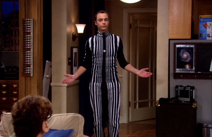
Sheldon-as-Doppler-Effect j.jpg

So yeah, in terms of badness, 2017/18 is nowhere on that level, but still, simplicity is key, and the shirts from the last two seasons had 11 and 7 stripes on the front (not including sleeves) of equal size, so they looked neat and pleasant.

The current model has one chunky white stripe down the middle and flanked by two chunky black stripes, the three of which take up most of the room on the front. It's like it doesn't know if it wants to be stripes, or something closer to "blocks" (think Ajax shirt).

And then there's the fact that it somewhat resembles the 2014/15 shirt due to the big stripes - the one from the season when we got relegated from League One. So doesn't exactly conjure up great memories.

But then we move on to the away shirt. And this is the second time in three seasons (third in seven, in fact) that a blue Notts top which could have looked very nice has instead been ruined with a ridiculous pattern.

In 2011/12, Notts were invited to play Juventus at their new stadium - and that godawful blue two-tone number they wore will forever adorn the memory until the end of time. And in 2015/16, the third kit just looked like a bus seat cover.

This year, the away kit makes use of azure and sapphire blue, which are nice shades in their own right, but then decides to combine them in some ghastly triangular pattern that resembles the old "bruised banana" Arsenal kit of the 1990s.
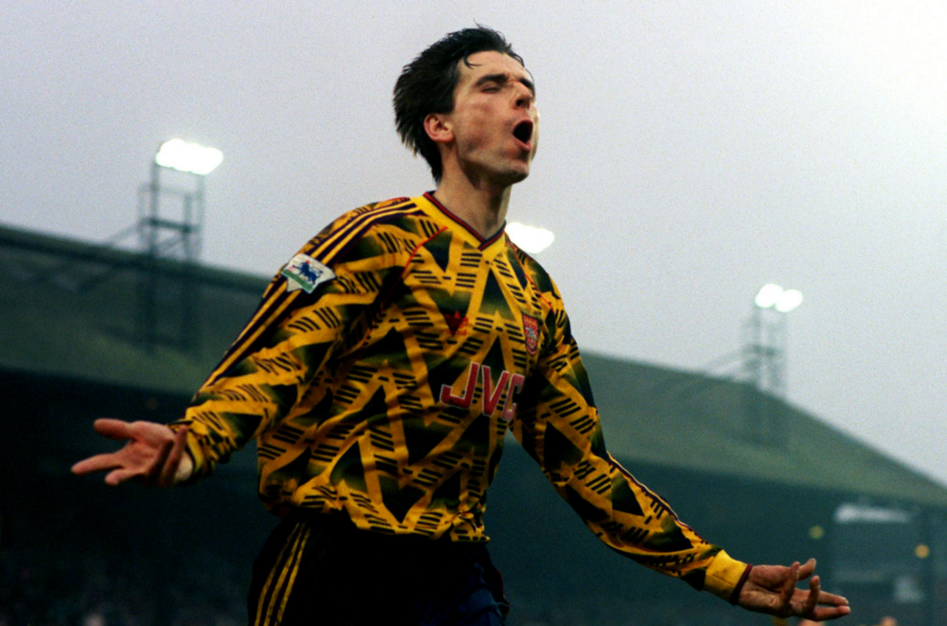
arse.png

Now we move to the third kit, which is a dirty "neon" yellow. If you're going to use a colour which is supposed to be bright and fluorescent, toning it down to a pastelly hue just doesn't look right. Kind of like an old highlighter which has pen smudged on it, so when you look at it, there's a sort of gray tinge there.

So that's just the shade of yellow, but in reality, the whole thing just looks totally insipid and uninspiring - you know when you go into Sports Direct and they have those bland kits which you can bulk buy for your five-a-side team? To me, the Notts third kit is basically that.

Next, the goalkeeper kits. Normally designers have a field day when it comes to these, adorning them will all sorts of weird and wonderful colours and patterns. Not these ones.

The first one, completely black, but with a random stripe of blue, pink and yellow on the sleeves, which just looks like someone left a couple of fabric strips on the prototype by mistake and someone came along and thought "oh, this must be it" and had it produced. And then a bright pink Puma logo, another spit of vivid colour in a failed bid to brighten up a bland top.

And then, the other two kits - a supposedly fluorescent yellow which is even duller than the third kit, to the point it just looks like snot, plus black stripes in another attempt to liven it up, and a mint green one which isn't really that much different to the mucussy yellow one.

Which leaves the training kit - and you know what? This is probably the best one of the lot. Frankly, this is what the away kit should have been - a nice shade of blue which isn't ruined by some overkill pattern, with a black panel at the top which has a diagonal blue stripe running to the neck. This one looks lovely - and you know what? It's the only kit in which the players are properly smiling!

So there you have it. That was my review of this season's kits. A little harsh, perhaps, but I'm just one guy with a humble opinion. Chances are by the end of the year I'll have bought one of each and will wear them on rotation, but for now, I'm not impressed.

Share your thoughts about this feature article on Pride of Nottingham by signing up to the website, visiting the forum and joining in the chat with hundreds of fellow Notts County fans.

  • Like 4


Share your PRIDE with PON! Visit our Community Forum

Join us - Discuss - Write for us - Debate - Contact us


Member Feedback

Recommended Comments

Chris

Posted

😂😂 Just goes to show you can't please everyone!

  • Like 2
Joe Jones

Posted

#HARDYOUT :devil:

  • Like 1
Chris

Posted

#BruisedBanana 😂🤣

NottsGeezerCal

Posted

I agree with you @Joe Jones.The only one I liked is the home one and even that's at a push. I would've liked the black goalkeepers shirt but they ruined that with the multi colours on the sleeves for me, seriously what is the point of that multi colour line? As for the away and third kits I can only hope they look better with a sponsor on because the away kit is huge let down in terms of design, by sticking that pattern on it, they completely ruined it for me. And the yellow one I just don't like the colour.

  • Like 1
DangerousSausage

Posted

Good reading as always @Joe Jones. Stripe thickness is a matter of opinion, personally I prefer thicker to thinner. The traditional look would be in line with last season's kit but we can't have exactly the same every season. I wouldn't have minded having the black and white reversed, with the black in the middle and the badge on the white. That way the sponsor only obliterates one black stripe instead of two. But all in all I think it's the nicest home shirt we've had in a while.

The rest look like off-the-peg jobs though, not keen.

Elite_pie

Posted

A good read Joe, but two things make me doubt your judgement a bit - firstly you saw last season's away kit as "a nice, strong, bold colour (hot pink, not red!)".  Wrong, very wrong - it was an awful colour in it's own right, but it's unforgivable borderline redness was just a step too far.  Secondly you openly admit you once disliked Oasis, although you do redeem yourself by citing youth and stupidity as mitigating circumstances (I can only use the latter these days).  I suppose there is a limit to what you can do with black and white stripes, and our 'outside the box' flirtations with chevrons, barcodes and pinstripes were all disasters, but I think the new one is a good effort.  I'd have to see the faded back stripes 'in the cloth' to see if they work, but I'm quite tempted to add the (lifelong Notts fan) Jake Bugg logo and make a rare full price purchase.

  • Like 2
Chris

Posted

3 hours ago, Elite_pie said:

A good read Joe, but two things make me doubt your judgement a bit - firstly you saw last season's away kit as "a nice, strong, bold colour (hot pink, not red!)".  Wrong, very wrong - it was an awful colour in it's own right, but it's unforgivable borderline redness was just a step too far.  Secondly you openly admit you once disliked Oasis, although you do redeem yourself by citing youth and stupidity as mitigating circumstances (I can only use the latter these days).  I suppose there is a limit to what you can do with black and white stripes, and our 'outside the box' flirtations with chevrons, barcodes and pinstripes were all disasters, but I think the new one is a good effort.  I'd have to see the faded back stripes 'in the cloth' to see if they work, but I'm quite tempted to add the (lifelong Notts fan) Jake Bugg logo and make a rare full price purchase.

Last seasons away shirt was only three shades from red, I used a design tool to compare and it's closer to red than it is pink.

Though I don't really get this 'lifelong Notts fan' stuff with regards to Jake Bugg, Paul Mace is a fan - as is some of the other sponsors involved and most of them actually have a foot print when it comes to Meadow Lane.

Joe Jones

Posted

Thanks for the comments all. This article was always going to be controversial due to how opinionated it is, how far I stick the boot in with regards to some of the shirts, and also because maybe it's a bit taboo to pass judgement on kits so early after they've come out - usually it's only when they're universally deemed bad that it's alright, otherwise it does dampen what should be quite a joyous occasion. I was very aware of this but hey, I'm brave enough to put myself on the line and express my opinion and take the flak.

Out of the tops I criticise, the home shirt gets off relatively lightly. Obviously I'm aware that, after two seasons of "standard" home shirts with slender stripes, there had to be a deviation from it this year, so it's just how it's fallen. It's much better than the monstrosities of 11/12 and 13/14, but I'm not going to pretend it's fabulous when I just don't rate it that highly.

The alternative outfield shirts, however, were not constrained by a need to break from the designs of the seasons just gone - they're just poor. And the goalkeeper kits appear to have had no effort put into them, hence my distaste for them.

But as I said, opinions will differ and every opinion is welcome. Even those who say I'm talking utter bollocks, it's all good, all comments welcome! :thumbsup:

liampie

Posted

i dont agree with everything you wrote jj but i accept your opinion. quite funny in places also!


Create an account or sign in to comment

You need to be a member in order to leave a comment

Create an account

Sign up for a new account in our community. It's easy!

Register a new account

Sign in

Already have an account? Sign in here.

Sign In Now

About PON

Pride of Nottingham

Pride of Nottingham is an independent fansite devoted to Notts County, the world’s oldest professional football club. Created in 2013, it has served as a source of Magpie news, features, match previews, reports, analysis and interviews for more than three years.

Support PON

Enjoy our content? Want to help us grow? Your donation will go a long way towards improving the site!

donate-pon.png

Meet the Team

Chris Chris Administrators
super_ram super_ram Global Moderators
DangerousSausage DangerousSausage Global Moderators
CliftonMagpie CliftonMagpie Global Moderators

Social Media

×
    Search In
×
×
  • Create New...

Important Information

Pride of Nottingham uses cookies to ensure you get the best experience on our website. To approve, simply continue using the site or click 'I accept' Terms of Use.